Displaying items by tag: brand
A Refreshed Brand Foundation to Align with an Expanded Mission
New tagline: Software Modernization Assured
New mission statement: Through technical ingenuity, dedication, and collaboration, we automate the modernization of high-value software, advancing organizations into a better business and technology reality.
New vision statement: Creating a world where organizations aren’t limited by technology.
As we mark our 25th anniversary, the TSRI you see today is a fresh, renewed TSRI. As we embarked upon the celebration of this milestone, we realized that our brand deserved to catch up to the advances the company has made in technology, delivery, and that we needed to better capture a track record of success and client-focus that our team is proud of. For a company that specializes in assuring software modernizations, it was time for form to reflect function.
TSRI’s mission has evolved. While we are known as a company that provides efficient and effective technology modernization, we needed to better communicate that our capabilities, while applicable to the modernization and refactoring of a broad array of legacy computer languages, are matched by our investment in the holistic guidance of our clients through their modernization journey and beyond.
We began with questions. Lots of questions. True to TSRI’s culture, we established our new brand as a team effort. We knew, all the way across the company, who we’ve been and how we show up for our clients: Precise. Dependable. Innovative. Collaborative. Experienced. Proven. But we also wanted our refreshed brand to take us forward. The logo, the colors, the design of our website, the printed materials we distribute… every place we make an impression we put on the table.
Understanding What Our Clients Value!
Our first step was to understand not only our unique brand personality and brand promise, but also to understand our clients. We undertook an exercise that forced us to dig deep—into the culture, how we feel we represent ourselves to our clients, and how we want to show the best of our expanded, collaborative end-to-end services. We explored multiple visualizations to convey the key pillars we knew would describe the evolution of TSRI.
Once we’d established our pillars, we explored what that personality would look like, starting with our new logo.
The Logo
![]()
TSRI’s previous logo made a statement: the classic red-black target was intended to imply precision and accuracy, which we do in fact prioritize, in the outcomes of transformations. However, it also confused some people about the mission of our company. We still wanted to maintain that idea of precision while remaining close to our roots. The brand mark, or icon, that was developed, as well as the abstracted moving reticle on our homepage, tells that story. The circular arrows inside the reticle show the forward-moving, iterative processes that make our modernization and refactoring projects highly successful while invoking the limitless horizons a modern codebase can open for our clients. Our clients trust us to think outside of the box as we partner with them to modernize, and they can trust that we will stick around to keep modernizing and support them in the evolution of their systems.
The TSRI word mark itself evokes that feeling of openness while the connected ‘S’ and ‘R’ feels almost space age—definitely futuristic!
Our palette
The two shades of blue that anchor our logo are TSRI's new primary colors.
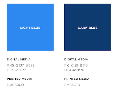
To us, the navy blue feels like professionalism, steadiness, and establishment. We paired that dark blue with a lighter sky blue to reflect the expansive ideas and experience our technical team and collaborators bring to each and every project.
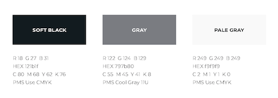
For our secondary colors, we landed on two lighter grays. These underscore the gravity of the systems we modernize. The soft black, clear and simple, represents accessibility to our clients.
Type
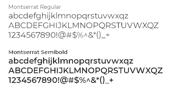
The typeface we chose to represent TSRI’s brand, Montserrat, is modern, refreshing, clean, inviting, and bold — we feel it represents our confidence in our own evolution and dedication to developing technologies and services in the service of our mission.
The Wider Angle

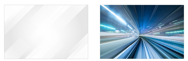
Colors, type, and logos can show off the brand, but more subtle cues guide its implementation. These include the angled lines that show our innovation, our forward thinking, and how we move our clients into the future. We use photos with more of an abstract feel that tell the story of how our products provide precise results, which are inherently designed to help keep project risk at a minimum.
Pulling it All Together
All told, the process of reimagining the TSRI brand took just under three months. While we knew we would end up with a tone and voice that would tell the story of TSRI’s end-to-end capabilities, we were so gratified to have everyone aboard to guide us toward the bold, forward-thinking statement that sets us on the path of our next 25 years.
TSRI is a team that can move you forward, and we feel as though our visual brand now conveys that more accurately. We are dedicated to helping you carry your critical software applications into the future. We are “software modernization assured.”
-----
TSRI is Here for You
As a leading provider of software modernization services, TSRI enables technology readiness for the cloud and other modern architecture environments. We bring software applications into the future quickly, accurately, and efficiently with low risk and minimal business disruption, accomplishing in months what would otherwise take years.
